Image conversion and sizing during static site generation
When I wrote the static site generator which powers this blog, I forgot about images. I usually find images distracting, so most of my articles rely on code or simple text. However, when I wrote the article about visual testing I knew that I needed to include images. So I decided to add that capability to my generator.
While I was at it, I also decided to learn more about image best practices on the web. You see, if you just insert <img> tags willy nilly, your page may suffer from cumulative layout shifts. This means that, for example, if a user scrolls through your article and an image loads above the fold he might lose his place and his reading flow will be interrupted.
To avoid this you need to add an aspect ratio to your image. There are several ways, but the easiest is to add the width and height attribute to the image tag with the actual width and height of the image. E.g. <img src="kitty.jpg" width="640" height="360" alt="kitty with striking eyes" />. Modern browsers then calculate the actual aspect ratio (16:9 in this case) and apply it to the picture. You can then use width: 100%; height: auto; in your CSS to scale the image to its container, keeping the aspect ratio and avoiding CLS.
This has additional importance if you want to use lazy loading. Which you should. Lazy-loading only loads the images once they are visible to the user. It used to be a massive hassle to add lazy-loading to images. Nowadays browsers handle it just fine. Just add loading="lazy" to your <img> tag and you are pretty much golden for most situations.
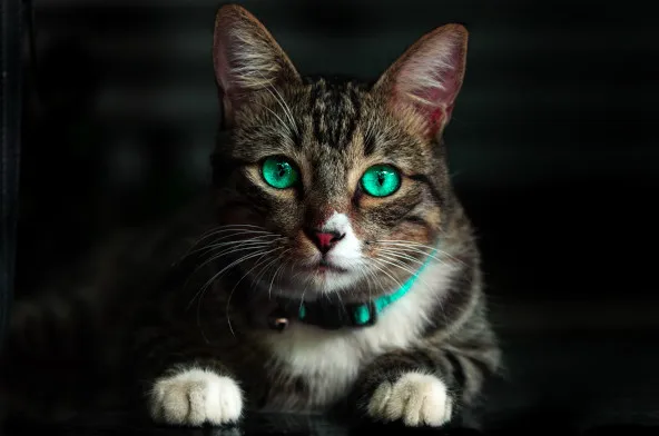
Additionally, even though I gave a file called kitty.jpg as an example, you should use a more modern image format for your website. Google currently recommends webp which offers both lossless and lossy compression.
Last but not least, I wanted to have an option to add a caption to my image. On the web, this is usually accomplished using the <figure> and <figcaption> tags respectively.
<!-- This example is taken from
     https://developer.mozilla.org/en-US/docs/Web/HTML/Element/figure -->
<figure>
    <img src="/media/cc0-images/elephant-660-480.jpg"
         alt="Elephant at sunset">
    <figcaption>An elephant at sunset</figcaption>
</figure>
So, in summary, my generator should be capable of the following:
- Convert images to webp
- Replace the
srcattribute of the<img>tag with a URL to the webp-image - Add
widthandheightattribute to the actual<img>tag - Add lazy loading
- Have the option to add a caption
Implementation
As I wrote last time, these articles are (mostly) written in markdown. By default, markdown has a very simple syntax for images.

While the markdown parser I use (marked) also allows putting HTML anywhere in the article, the option of doing all of this by hand seemed not very appealing to me. So I used its excellent Extension API to add my own <figure> syntax to marked, by writing an extension.
§[Caption-Text][Alt-Text](url-to-image)
This converts into the following HTML.
<figure>
    <img src="url-to-image" alt="Alt-Text">
    <figcaption>Caption-Text</figcaption>
</figure>
Unfortunately, marked currently does not support asynchronous renderers, so I couldn't add the conversion and metadata gathering via extension.
The easiest solution I found is to go through a couple of steps before a generated post is written to disk. To manage those steps, I added an Extension API of my own to my generator. The API allows me to run functions at different points in the process, including at the very end of post generation. The image extension parses the generated HTML using jsdom. Then it searches for all image tags. Then it uses the excellent sharp library to convert the images and read their metadata.
    const absolutePath = `${BASE_FOLDER}/${currentImageTag.src}`
    const finalPath = ...//a function to calculate image path based on hash
    const imageData = await fs.readFile(absolutePath);
    const image = await sharp(imageData);
    await Promise.all([image.webp().toFile(finalPath), image.metadata().then(metadata => {
        if (metadata.width && metadata.height) {
            currentImageTag.width = metadata.width;
            currentImageTag.height = metadata.height;
        }
    })]);
    currentImageTag.src = finalPath;
    currentImageTag.setAttribute('loading', 'lazy');
Finally, after additional post generation extensions are run the pipeline continues as usual and the HTML is written to disk.
Conclusion
This new syntax and image extension have made writing articles with images a breeze. I do not have to worry about the input format of images, or where I save them. For now, I just have to worry about not using truly massive images since their initial size isn't changed. But maybe, in the future, I can use srcset to serve them as responsive images.